
The visible fruit
of your brand
→
Logo design
At Harvest, we approach every logo project like a crop to be tended: we start by understanding your story, your ambitions and your audiences, then explore shapes, colours and typefaces that express this essence clearly and with emotion.


Every proposal is designed to carry a message, spark a connection and give birth to an instantly recognisable visual identity.
The process includes several concrete steps: research and mood boards, sketches, prototypes, tests on different media, and adjustments until we reach the perfect balance between originality, legibility and longevity. We make sure your logo stays strong, adapts to every size and use, and becomes your brand’s visual landmark.
A successful logo is like ripe fruit: simple, beautiful, memorable, and carrying all the richness of your brand, ready to be shared and recognised in every interaction with your audience.
Logo design at a glance
A logo is the sign that represents your brand: a designed name, a symbol, or both together. At Harvest, a communication agency in Lyon, France, designing a logo usually takes 2 to 4 weeks and starts from three creative routes. We most often design it as part of a complete visual identity, because a logo is at its strongest when colours, typefaces and usage rules come with it.
What makes a good logo
- Legible at every size, from a 16-pixel favicon to a shop sign or trade show stand.
- Memorable: a simple shape you remember after a single glance.
- True: it says something real about your business, your values or your story.
- Lasting: it does not rely on a design trend that will look dated in three years.
- Adaptable: in colour and monochrome, on light and dark backgrounds, in long and compact versions.
Our approach
- Understand. We talk about your story, your business, your audiences and your competitors.
- Explore. Research, mood boards, sketches: we look widely before choosing.
- Present three routes. Each one is explained and shown in context, on your actual materials.
- Refine. Revisions are unlimited on the chosen route.
- Deliver. You receive the logo and its variants in every useful format, for print and for the web.
A logo alone or a full identity?
We rarely design a logo on its own. Without colours, typefaces or usage rules, every new piece reinvents the brand in its own way, and the logo loses recognition. If you already have solid guidelines and only the logo needs to evolve, we can discuss it; in most cases, we recommend building the whole system, possibly starting with the essentials: see brand guidelines.
A few logos we have designed
- Graviti: a concentric circle and a G that evoke the calm of floatation tanks.
- Serf: an identity built around the S, for Santé (health), Savoir-faire (expertise) and infinity.
- Zadig Avocats: bold typography, between modernity and expertise.
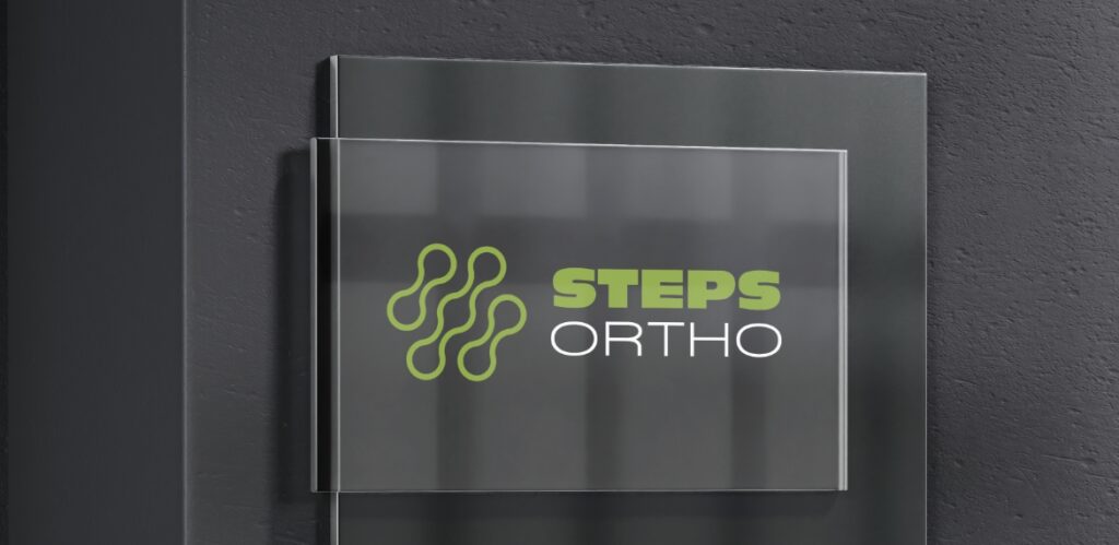
- Steps Ortho: implants, plates and screws as so many links that support walking.
Find out more: logo redesign, when and how to go about it (in French).
Frequently asked questions
How long does it take to design a logo?
Allow 2 to 4 weeks at Harvest, from the initial conversation to the delivery of the files. The timing mainly depends on how available the people who sign off on your side are.
How many logo proposals do you present?
Three distinct creative routes, then unlimited revisions on the route you choose.
Do you design a logo on its own, without a visual identity?
Rarely. A stand-alone logo quickly loses consistency from one medium to another; we almost always recommend placing it within a visual identity, even a compact one.
In which formats is the logo delivered?
In every format useful for print and the web: vector files for print and signage, images for the website and social media, in colour and monochrome.
Can an existing logo be modernised without losing recognition?
Yes. A redesign can keep what makes the logo memorable (a shape, a colour, a rhythm) and rework the rest. It is often better than a complete change when the brand is already well known.
Selected work

Who
we
are
